
Film / sleeve / stage
Visuals
Five studies in the world around the music.
Anton Corbijn. Faces. Symbols. Light.
Part 1 of 5
The Anton Corbijn Era: Forging the Visual Mythos
The beginning of a shared visual language.
Corbijn’s first Depeche Mode video was A Question of Time in 1986. The official archive explicitly identifies it as the start of his directing work with the band; Strangelove followed in 1987. It is a useful correction because it puts the visual partnership inside the Black Celebration period.
Texture and distance
Our viewing suggestion is to notice how a person occupies the frame. How close are we allowed to come? Does the setting support the figure, or make them seem small? Grain, contrast and empty space can change our reading of a face without the need for a literal narrative.
The image can leave a question open
A striking music video need not explain every lyric. Watch once for the sequence of events, then again for the relationship between image and music. Does the picture intensify an emotion, interrupt it, or introduce something that was not obvious in the recording alone?
·
Part 2 of 5
Faces in the Frame: Casting and Character
Look at who shares the picture, and how the camera gives them a role.
A music video creates relationships through framing and editing. A figure can become a character through a glance, a movement or a cut to somebody else. Behind the Wheel provides a visual starting point: follow how the film shifts your attention between people, movement and the surrounding setting.
Watch the edit
On a second viewing, notice when a close view gives way to distance. What does each change allow you to recognise? How much of a person’s identity comes from a face, and how much from costume, posture or their place in the story?
Recognition at a distance
Distance can make costume and posture more important than facial detail. Follow those changes and notice how the film keeps a character recognisable as the camera moves closer or farther away.
Try the same exercise with Enjoy the Silence. Its king figure is a useful comparison: the costume and the landscape can remain recognisable even when the face is small within the frame.
Part 3 of 5
The Iconography of the Rose and the Bible
Romance, faith and the meanings we bring to a record sleeve.
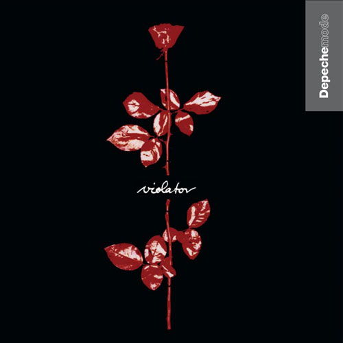
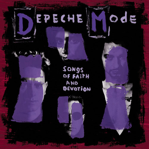
The rose on Violator can suggest affection and fragility; its stark setting can also make it feel unsettling. That tension is our interpretation of the finished image. It is not a claim that the designer prescribed one meaning for every listener.
One symbol, many encounters
Look at the cover before playing the album and again afterwards. Does it feel different once you have heard the music? A familiar sleeve becomes attached to listening experiences, so the personal meaning of a symbol may grow far beyond its original design brief.
Faith without a fixed decoding key
The layered portraits on Songs of Faith and Devotion give us a different arrangement of faces, lettering and colour. The album title invites religious associations, but the sleeve need not be described as a documented imitation of Renaissance painting.
Compare the two images. One concentrates recognition around a single emblem; the other makes the band members part of a dense composition. Our question is how each image prepares you to listen, rather than which one contains the “correct” hidden message.
Explore sleeves and design → · Read The Theology of Martin Gore →
Part 4 of 5
World Violation: Taking the Visual Identity on Tour
How an album’s imagery becomes part of a live era.
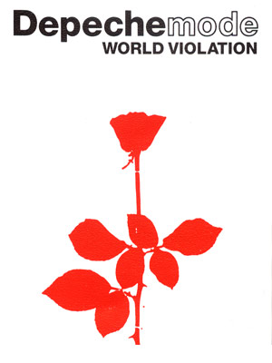
The official World Violation tour archive provides the historical route through the 1990 dates. Its rose artwork also gives us a visible connection between an album campaign and a touring identity: a recognisable image carries across different settings.
From a square sleeve to a larger setting
Compare the tour artwork above with the Violator sleeve. Notice the change in background, the lettering and the way the flower occupies the available space. An identity can remain familiar while its presentation changes.
Look for scale
When exploring stage imagery, ask how a composition works for somebody far from the performers. Large shapes, light and repetition can direct attention differently from a close-up portrait. Notice what stays readable at a distance, and what invites a closer look.
Follow the rose from sleeve to tour artwork, then explore the wider stage collection. The interesting relationship is between recognition and transformation: what stays familiar when the scale and setting change?
Explore the official World Violation archive ↗ · Explore stage design and concert films →
Part 5 of 5
Devotional: The Stage and the Film
Performance, projections and the camera’s version of a concert.
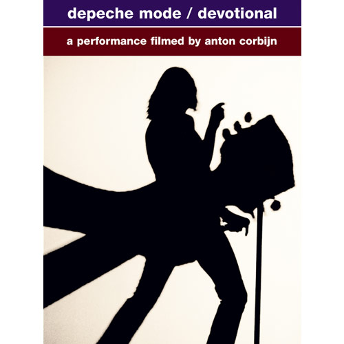
Devotional gives us a concert and a way of looking at that concert. The official archive lists the DVD’s separate tour projections, an Anton Corbijn monologue and tour programmes among its extras. Those materials let a viewer examine elements that the main concert edit brings together.
See the parts separately
Choose a projection available in your edition, then watch the corresponding performance. Where does the camera move your attention? How much of the surrounding image remains visible when the film cuts to the singer?
A film is also an arrangement
The archive notes that the live Condemnation music video uses a different edit from the main concert film. That makes editing itself part of the visual story: the same performance material can be presented in more than one way.
A powerful stage image can suggest ceremony, vulnerability or release. Watch how the film builds those impressions through scale, movement and the time it allows a shot to remain. The performance and the act of looking become inseparable.
Explore Devotional’s visual contents ↗ · Read the projection viewing guide →
Sonics
Five studies in B-sides, remixes, Hansa, studio accidents and demos →